WEB COPY
USE SALES PSYCHOLOGY
- If an offer sends people to your website, don’t distract the customer from their purchase. Remove extraneous links, even headers and footers, to let them focus on the offer.
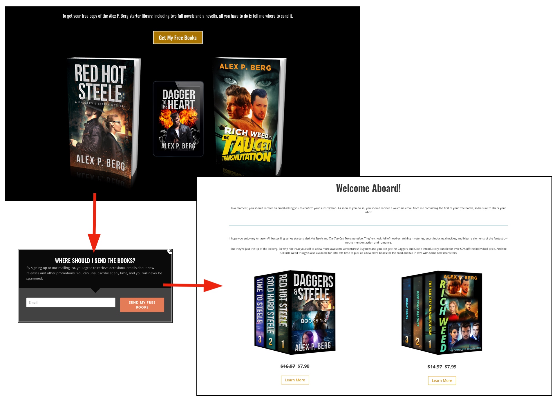
- Use Lightboxes to your advantage. Don’t force the user through screen upon screen before completing a purchase. Make the experience seamless.
- Make a value proposition. Instead of asking for something (an email address), make an offer (a bonus or freebie) and ask where to send it.
- Always try to upsell, cross-sell, or downsell. Here, we use a free ebook offer for lead generation, but for those customers who complete the offer, they are presented with a discounted option on multi-book bundles.
TAILOR THE COPY
- The placement of the product on your website will dictate the space available for the copy. A product page and a category page will have very different copy requirements.
- Tailor the copy to the space, whether it’s two sentences, six, or twelve. Don’t cut and paste!
- Ensure the user experience is top notch, regardless of device. The length of copy might be different for desktop, tablet, and mobile.
- As always, polish the copy until it shines!


